Poster clinic: Examples and extra resources
Part 4 in a series
To make the design process more concrete, let’s consider a typical ‘wall of text’ research poster and see how we can improve it step-by-step.
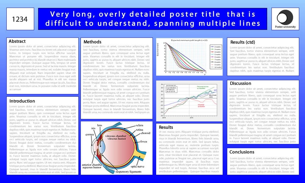
Looking critically at the contents, you will see that much of the text is not essential. Some parts state facts that your target audience is likely to already know. Other parts are repetitions and some parts are just fluff to make it sound better. We start by taking out these parts, along with the unnecessary abstract section and one unimportant image, keeping only the parts in green. The numerical data in the Results section can be turned into a table that is a lot easier to understand. The title can also be simplified.

In the reorganized poster, the essential elements such as the main figure and the take-home message should stand out. For example, feature the figure very large in the center and give it a light orange background. The title and take-home message can be put in a bright orange box with a large font. Aspects that are less important for your personal storytelling (e.g. text blocks) should go into white boxes on the side of the figures. These don’t need to stand out, just like the eye image that can be in greyscale. The extra information, which is least important, goes in a grey box somewhere out of the way. The resulting design will make all the main points in your story stand out immediately, even if you are not there to talk about it.
It doesn’t take much work to create a better-looking poster…

Since people are often visual learners, make sure to bring anything that can help visualize your research story. If you present a new app, show it on your phone. If your work involves virtual reality, bring a VR headset. If it is about a molecule, bring a model. A time series of pictures can be turned into an animation on a tablet, etc.
Also, don’t be afraid to do something original with your design! At the 2014 ARVO meeting our research group featured a round poster. This simple idea made it look so different from all others that it stood out from a distance and attracted lots of attention. In another field someone even made an entire comic poster of her work.

One final tip is to make sure to practice your poster talk as a 30-second elevator pitch and a longer, two-minute version. The better you are prepared, the better you will be able to tell your story.
Good luck!
There are some great resources that discuss tips in more detail :
- A video by Mike Morrison explains the problem with the way scientific posters are being used and proposes a new, bare-bone design to address this. You can find many examples on his Twitter feed. His design is great for when you are presenting, but perhaps requires more details for readers visiting between poster sessions.
- A long list of important design tips by Colin Purrington.
- Better Posters features tons of design tips, including a Bad Poster Bingo to check the quality of your design.
- How to Design an Award-Winning Conference Poster by Animate Your Science.
Jos J. Rozema, MSc, PhD